About Biberify
The Value Of Less: Biberify And Minimalism
A recipe that preserves fermented pepper’s character, a design that keeps the sauce visible, and two permanent series: at Biberify, minimalism means making room for flavour, meaning and new pairings with a limited set of tools.
Choosing And Making Room
Through a transparent label, the sauce’s colour becomes part of the design. Within the icon’s empty space, a pepper silhouette appears. With two permanent sauces, discovery continues in the food and at the tables where they are shared. These relationships express Biberify’s understanding of minimalism: limiting the tools we use while making room for flavour, meaning and new encounters.
Here we approach minimalism as a way of explaining our brand choices, rather than transferring the rules of an art movement to a recipe. We want to preserve the character of fermented pepper, necessary functions and clear product information. What an ingredient, a form or a word serves determines how much space we give it. Losing a necessary function through reduction, or needlessly repeating an existing role, would not achieve the simplicity we seek.
Exploration lies behind this focus. Our curiosity began with growing our own hot peppers in 2016 and led us to discover the tastes and aromas of different peppers.
In his 1976 speech, Dieter Rams considers form, colour, material and construction in relation to a product’s purpose, finding the grounds for aesthetic decisions within that whole. The thought that speaks to us is that simplicity concerns what the parts do and how they are arranged together before it becomes a surface appearance. The attention we give small details when working with few tools follows from this division of roles.
Remembering to subtract when considering an improvement may itself require effort. In experiments published in Nature in 2021, Adams and colleagues found that participants overlooked useful subtractive solutions under certain conditions. Juvrud and colleagues’ 2024 study found that results varied with task, age and sample context. These findings invite us to consider a change in its context and to examine subtraction alongside addition when seeking improvement.
In Book II of the Nicomachean Ethics, Aristotle distinguishes an appropriate measure from the arithmetic midpoint between extremes, considering what is relative to a person and situation alongside reason and sound judgement. The connection we draw with this ethical discussion is that sufficiency is assessed in relation to a purpose: pepper’s character, its accompaniment to food and enjoyment at the table. An element may contribute meaning or aesthetic pleasure as well as practical function. We assess its place through that contribution to the whole.
Fewer Ingredients, Relationships In Flavour
In the kitchen, this approach begins with each ingredient’s role before the length of the list. We place the fermented pepper blend at the centre of the recipe and set the proportions of its accompaniments to keep that character distinct. Limiting the number of flavour-giving elements calls for closer attention to each contribution: understanding what an added ingredient serves and what it changes within the whole.
An ingredient list shows what goes into a recipe; fermentation invites us to consider what those ingredients can become over time. In lactofermentation, lactic acid bacteria produce lactic acid from sugars, alongside other changes related to taste and aroma. At Biberify, we work with spontaneous natural fermentation. The transformation of our chosen ingredients offers one way for flavour to develop layers without adding another ingredient to the recipe.
Umami, acidity and depth of flavour alongside pepper heat are perceptible traces of this transformation in the recipe. We bring the contributions of lactic acid, vinegar and citric acid into the same acidic structure, considering sea salt and the gentle sweetness of ripe peppers within that relationship. In a whole built from few elements, a small change in proportion can affect more than one sensation. Simplicity therefore calls for greater attention to proportion.
How an element is perceived within a mixture also depends on what accompanies it. In experiments comparing aqueous taste mixtures at specified concentrations, Green and colleagues found that some tastes were perceived less intensely when presented together. An ingredient’s perceived intensity alone could differ from its effect in a mixture. This idea of interaction matters when considering a recipe: attending to an ingredient’s relationships as well as its share of the whole.
Consistency also shows why an element is needed. The fullness of fermented pepper is accompanied by the thickening function of fermentation-derived xanthan gum. The body we seek is the fullness perceived as the sauce joins the food in the mouth. We want that fullness, spreading through the bite, to give way after swallowing and leave room for the next bite. We explain an ingredient’s place in the recipe through its role in this experience.
Working with few ingredients does not mean settling for a single sensation. Taste, smell and texture contribute to flavour, while pepper heat also contributes to chemical sensation in the mouth. We experience these sensory contributions together in a bite. We therefore consider what the sauce brings forward, how it accompanies the food and what impression it leaves in the mouth.
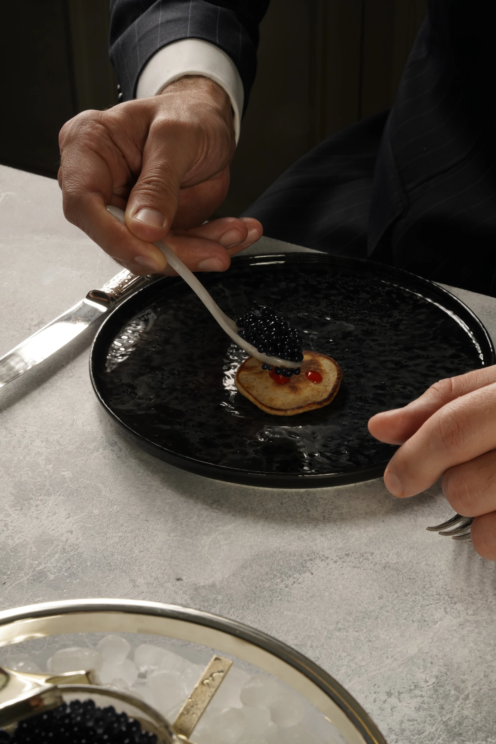
You can follow this division of roles at the table. Olive-oil focaccia, a margherita pizza with tomato and cheese, or whole-wheat blini offer starting points with distinct characters. Take two small bites of the same food, leaving one as it is and adding a little Biberify to the other. Attend both to the sensations the sauce adds and to the qualities of the food that remain distinct.
The Product Becoming Part Of The Design
The relationship between a centre and its accompaniments in flavour becomes a division of roles in visual design. The bottle carries the sauce, the label introduces it and the packaging completes its presentation. Designing these parts together means considering the first encounter, the order in which information is read and access to the contents. Letting each part do its own work limits unnecessary repetition of the same message and competition between elements.
The transparent label allows the sauce’s own colour and texture to become elements of the visual arrangement. The inspiration is a peacock opening its feathers to reveal the beauty within. Leaving part of the surface to the product removes the need to depict its colour again. The contents complete that part of the design; simplicity creates space for the material itself to appear.
On Biberify Orijinal’s front label, the eye moves from the icon and Biberify logotype to the series name and then the product description. Spaces and distances help this sequence remain clear. In the black asymmetrical zigzag, we use the teeth of the snake in our icon, treating that visual connection as a sign of Biberify holding on to food, drink and people’s minds. The same element brings movement to the surface and carries the brand’s meaning.
Simple packaging can also shape consumers’ expectations about its contents. In Ton, Smith and Sevilla’s study, simple packaging was associated with inferences of fewer ingredients and perceived product purity. Its effect on willingness to pay varied with brand type and consumption goal. Visual arrangement is thus part of the first encounter with a product; the expectation it creates deserves consideration alongside what it shows and explains.
At Biberify we use the visible product and explanatory language together. The transparent area introduces colour and texture; information about ingredients, flavour and our approach to production invites a closer acquaintance. Making room for product information while limiting visual elements is part of this design’s responsibility.
Sources For This Section
The Layers Carried By A Boundary
The space within or around a form is called negative space. A solid form and its surrounding space can share a boundary; a shape’s outline also defines the adjacent area. The pepper silhouette in Biberify’s icon arises from this relationship. Space is one of the elements completing the sign’s meaning.
The curve of the abstract snake rising upward and breathing fire from its open mouth also forms a flame. We gather the powerful elements of flavour in this snake; its reins and saddle express directing that strength through production techniques and blending. As the space it encloses is read as a pepper, the same boundary takes part in two different forms. The icon’s meaning develops in the area we leave open as well as in the shape we draw.
We preserve space around the icon so that solid form and empty space can be seen together. Bringing these meanings into one sign allows layers of expression without adding another sign: the snake’s curve suggests a flame, and the space it encloses describes a pepper. Here, minimalism offers the possibility of layered meaning without multiplying the drawn elements.
Sources For This Section
From Lettering To Language: An Arrangement Of Roles
This approach does not require every element to look alike. We seek consistency by assigning different tasks to a small set of defined tools. We give our two typefaces distinct roles: reading the main text and expressing the identity are complementary tasks within the same arrangement.
We give Poppins the task of carrying body text. The geometric sans serif’s rounded forms create a visual affinity with the body and balance we seek in flavour. Indian Type Foundry’s account of the design describes optical adjustments at stroke joins. Such small corrections behind an apparently regular letterform offer a concrete example of simplicity being built through attention to detail.
Amiri, used in headings and the logotype, takes another role through its serifs and curves: bringing a sophisticated expression to the reading order. Red carries fermented pepper’s vitality into the identity, with Pantone 1795 C in print and our chosen #E50914 in digital applications. Giving a few visual tools distinct roles lets us build coherence while retaining variety.
We choose words with the same care. Terms such as umami, aroma, body and consistency are explained through what they mean in tasting. Short, clear sentences should help readers reach the information they need and relate it to their own experience. We want each word to carry meaning and to complete that meaning with the words beside it. Simplicity in language is built while preserving the necessary explanation.
Sources For This Section
Permanent Series, Clear Names
Biberify Orijinal and Biberify Saf are the two names in our permanent range. Biberify Orijinal names the main sauce. Biberify Saf’s simpler ingredient list, lower heat and lower acidity bring the intense notes of fermented pepper forward. We keep this first distinction brief in the names, leaving detailed flavour descriptions to the accompanying information and the tasting itself.
What becomes simpler here is the task assigned to the name. The name gives an initial direction; the ingredients, flavour and story unfold in the explanation. Sharing information between the name and its description eases the passage from a brief first encounter to a fuller reading. A few words become a starting point for finding out more.
Preserving A Decision
We have reached the flavour character we sought in these two series. Keeping them permanent means taking responsibility for preserving the balance we established and each product’s identity over time. Two series is a decision for our own product family; we focus on the continuity of these two distinct characters. Here, minimalism includes taking responsibility for a choice after making it.
Knowing Biberify Orijinal’s or Biberify Saf’s heat, acidity and flavour character gives you a reference when using it in another dish. Earlier experiences can become the starting point for new pairings.
While the sauce remains familiar, the food, drink, setting and people at the table change. Variety in experience need not depend on an expanding range of bottles. The space we leave open with a limited product family lies in the relationships you can form with it: a familiar flavour gaining new details at another table.
A Time For Each Special Series
While the permanent series maintain a familiar character, special series give discovery its own time. We create new flavours with seasonal ingredients, giving priority to geographically indicated products when choosing them. Where an ingredient comes from, and why it is brought together with others, become part of a series’ flavour and story.
We offer only one special series at a time. Preparation for the next begins while the current series nears its end. This gives each flavour its own period and lets variety unfold in sequence. Limiting the choices we present at once is also part of the attention we give each one.
Biberify 3 Yıl, bearing its three-year fermentation time in its name, formed part of this journey as Türkiye’s longest-fermented hot sauce. With the next special series, we moved to numbering: Biberify 101. In the sequence we plan to continue with 102, 103 and 104, each name tells where the new flavour belongs.
Rather than give one series a more emphatic name than another, we introduce them all in the same numerical language. Without creating a hierarchy among names, we want to direct curiosity towards the selected peppers, seasonal ingredients and resulting flavour. The series number gives the direction; the ingredients carry the story.
The simplicity of numbering makes room for differences without creating another hierarchy through names. In the permanent range, a limit preserves focus and continuity; in special series, variety unfolds over time. Accepting an ending is part of this approach to giving a flavour its own place and time.
We also accept the ending of a special series within this way of choosing. When the period given to a flavour ends, the personal meaning of the meals shared with it may continue. Giving certain encounters a time of their own, rather than continually multiplying everything, is also part of our understanding of minimalism.
Sources And Further Reading
- NIDCD — Taste Disorders
Reading area: How taste, aroma, texture and other oral sensations contribute to flavour; distinguishing pepper heat from basic tastes.
Accessed:
- Getty · Understanding Formal Analysis
Reading area: Positive and negative space, and the relationship of form to surrounding space; hue, lightness and intensity; surface texture and reflected light.
Accessed:
- Dieter Rams · Design by Vitsœ (1976), pp. 1–2
Reading area: Design thinking that relates form, colour, material and construction to a product’s purpose.
Accessed:
- Adams et al. · People systematically overlook subtractive changes (2021)
Reading area: Overlooking useful subtractive options in specific problem-solving tasks; publisher record and PubMed abstract.
Accessed:
- Juvrud et al. · People overlook subtractive changes differently depending on age, culture, and task (2024)
Reading area: Task, age and Swedish/US sample differences in findings about subtractive options.
Accessed:
- Aristotle · Nicomachean Ethics, II.6 (translated by W. D. Ross)
Reading area: Distinguishing an appropriate measure relative to a person and circumstances from an arithmetic midpoint.
Accessed:
- Green et al. · Taste mixture interactions: suppression, additivity, and the predominance of sweetness (2010)
Reading area: Intensity and suppression in aqueous taste mixtures at specific concentrations.
Accessed:
- FAO — Fermented Fruits and Vegetables, Chapter 5
Reading area: Lactic acid bacteria converting sugars into lactic acid; a general conceptual framework for lactic acid fermentation of fruits and vegetables.
Accessed:
- eCFR — Xanthan gum, 21 CFR §172.695
Reading area: The separate fermentation process used to obtain xanthan gum and its general thickening function.
Accessed:
- Ton, Smith and Sevilla · Symbolically Simple: How Simple Packaging Design Influences Willingness to Pay for Consumable Products (2024)
Reading area: Simple packaging, inferences of fewer ingredients and participants’ perceived purity; willingness-to-pay effects vary with brand type and consumption goal. Author institution abstract; online publication in 2023, journal issue in 2024.
Accessed:
- Indian Type Foundry · Poppins, original project description
Reading area: Indian Type Foundry’s original project description: geometric and circular letterforms, optical corrections at stroke joins and even visual density in text.
Accessed:
- Biberify · Our Story
Reading area: Biberify’s own chronology: growing peppers in 2016, exploring blending and fermentation in 2020, and deciding to share the sauces at the table in 2024.
Accessed: