01 / Intention
The Brand’s Essence
Biberify’s brand identity draws on the story of its fermented hot pepper sauces. The sense of proportion we seek in flavour is also the starting point for the visual identity.
Balance
We consider the proportion and effect of each element in relation to the others.
Minimalism
Each element has a reason to be there.
Label Transparency
It keeps the sauce’s colour and texture visible; we treat the product’s own appearance as part of its identity.
Sophistication
Amiri’s curves and the label’s asymmetrical zigzag give the simple design a sophisticated character.
02 / Positioning
Positioning
Biberify is for people who seek greater enjoyment in food and drink and look for quality products. Our understanding of flavour is a balance of umami, sour, salty and gently sweet notes with pepper heat. Fermentation-derived lactic acid and vinegar establish the acidity; citric acid adds depth as a third source. The aim is to enliven the aroma of food and drink and bring richness to the palate without obscuring their character. With this approach, we invite you to discover new flavour pairings in a familiar bite and sip. The connection we seek is an experience at the table that begins with curiosity and grows through passion.
03 / Biberify
A Name In Motion
The name Biberify comes from the idea of adding pepper to everything.
The icon is our visual symbol; the logotype is the distinctive drawn form of the Biberify name. Together, they form the brand’s visual signature.
04 / Form And Meaning
Balance Within The Icon
Our logo icon depicts an abstract snake rising upward and breathing fire from its open mouth. The curve of its body forms a flame motif. A pepper silhouette emerges in the negative space within the icon.
The snake represents the powerful elements of flavour. The reins around its neck and the saddle on its back convey the idea of bringing this strength under control through production techniques and blending.

05 / Pantone 1795 C
The Vitality Of Colour
We chose Pantone 1795 C red to bring the colour of the fermented pepper blend into the identity and convey vitality and dynamism. Black is used for the label’s asymmetrical zigzag, and white for lettering on dark backgrounds. Off-white provides the background for text on the website.
RedLogo Icon · #E50914
BlackLabel Zigzag · #080808
WhiteLettering · #FFFFFF
Off-WhiteText Background · #F4F1E9
Pantone 1795 CPrint Colour Reference
06 / Poppins And Amiri
Two Characters In Typography
We use Poppins for body text. We chose the clean, rounded forms of this geometric sans serif to express Biberify’s full-bodied, balanced, rounded flavour and aroma visually. Many of its letters are based on circular forms; optical adjustments at stroke joins maintain an even visual density in text. Its clear appearance is built from small adjustments working together.
The serif typeface Amiri appears in headings and the logotype. Through its curved letterforms, we aim for a colourful, sophisticated expression within a minimalist arrangement.
Body Text
Geometric, Rounded Forms
Headings And Logotype
A Colourful, Sophisticated Character
07 / The Product In View
Transparency In The Label
The label’s generous transparent area makes the sauce’s colour and texture visible. A peacock fanning out its feathers to reveal the beauty hidden within inspired this visibility in the design.
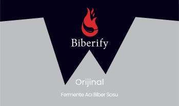
The black asymmetrical zigzag on the label forms the teeth of the snake in our icon. We use this mark as a symbol expressing how Biberify attaches itself to food and drink, and from there to people’s minds.
On Biberify Orijinal’s front label, the icon and Biberify logotype are followed by the series name and the words “Fermente Acı Biber Sosu” (“Fermented Hot Pepper Sauce”). This hierarchy is intended to guide the eye from the brand to the series and then the product description.
08 / Naming
The Clear Language Of The Series
Our permanent series are Biberify Orijinal and Biberify Saf. Biberify Orijinal is our main sauce. With a simpler ingredient list, lower heat and lower acidity, Biberify Saf focuses on the intense notes of fermented pepper.
The numbered sequence began with Biberify 101 after the Biberify 3 Yıl special series, fermented for three years. We plan to continue it with 102, 103, and 104. For the special series, we choose ingredients suited to the season and give priority to products with geographical indications.
Biberify Orijinal
Permanent Series
Biberify Saf
Permanent Series
Biberify 101
Numbered Special Edition
09 / Words And Style
The Brand’s Voice
We describe the product in clear, informed and inviting language. When using gastronomic terms such as umami, acidity, aroma, body and consistency, we explain what they describe within a bite.
We present production information, brand intentions and general scientific findings in their own contexts. We describe our sensory aims as an invitation that leaves room for the reader’s own experience. We clearly distinguish a product measurement from a finding in general research.
Tasting Invitation
Taste the food first without sauce, then with a small amount of Biberify.
Explaining Body
By body, we mean the sense of fullness the sauce gives in the mouth.
Production and Series
We fermented Biberify 3 Yıl for three years. We then began the numbered sequence with Biberify 101.
10 / Usage Principles
Preserving Coherence
Check the application at the scale and on the background where it will be used. The icon’s pepper silhouette, reins, and saddle should remain discernible; the logotype, series name, and product description should be legible.
- Assess the print application on a physical proof that also accounts for the product’s appearance.
- Check the digital application on a small screen and at the actual display size.
Sources And Further Reading
- Indian Type Foundry · Poppins, original project description
Reading area: Indian Type Foundry’s original project description: geometric and circular letterforms, optical corrections at stroke joins and even visual density in text.
Accessed: