Art And Design
A Shared Language Of Red: Reading The Colour Of Peppers
“Red” leaves considerable room when describing a hot sauce. Do we mean the dark surface inside the bottle or a thinning trace on the plate? Patrick Syme’s colour book of 1821 calls upon objects and particular parts of them to make a description precise. Pepper appears in the book, though our first encounter is with a dark line on its leaf rather than its red fruit.
A Pepper Leaf Gives A Colour Its Address
We open the book looking for red and first encounter the pepper through its leaf. Row 49 of the greens table gives the dark markings on Cayenne pepper leaves as its botanical example of Blackish Green. Serpentine appears in the mineral column of the same row. A particular appearance of two otherwise distant objects can thus be compared under one name.
The written description on page 35 explains Blackish Green as grass green mixed with a considerable amount of black. The natural example in the plate and this description guide us in different ways: one identifies the surface to look at, while the other describes how the colour becomes darker.
Even “the Cayenne pepper leaf” is too broad for this example: the chart directs us to its dark streaks. Describing where a sauce’s colour is seen offers a similar precision. The mass viewed through glass and a thin spread on a plate may be two encounters with the same sauce. A comparison becomes useful when we know where it directs the eye.
Sources For This Section
Werner’s Name And Syme’s Eye
Abraham Gottlob Werner, whose name appears in the title, was the mineralogist who sought to classify mineral colours in 1774. Flower painter Patrick Syme expanded the approach with examples from the animal and plant worlds. London’s Natural History Museum gives 1814 as the first edition’s date; the Smithsonian copy’s title page states “second edition” and 1821. Page 9 of the 1821 edition gives the number of standard colours as 110.
On printed page 6 of the introduction, Syme argues for using verbal description, illustration and colour in combination. The same name applied to different shades may bring different surfaces to the minds of speaker and listener. A precise example, such as the streak on a Cayenne leaf, anchors the word to somewhere one can look. Readers find a name, a colour sample and a counterpart to seek in nature.
Coral, Tomato And Mineral: Red Along One Row
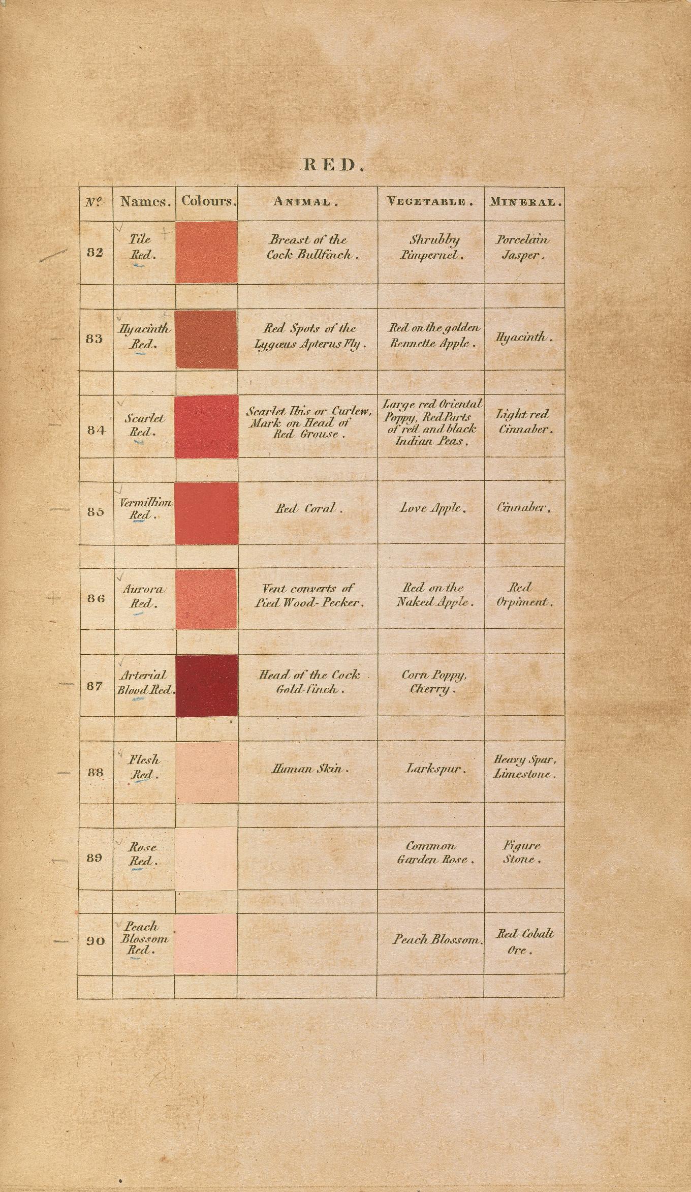
Row 85 of the red table is named Vermilion Red. Its animal, vegetable and mineral columns list red coral, Love Apple and Cinnabar, respectively. Merriam-Webster defines love apple as tomato. A familiar kitchen fruit thus joins coral and a mineral in the same colour comparison. What links the objects in the row is a resemblance in appearance.
The table also distinguishes details within the same red family. Hyacinth Red in row 83 is associated with the red part of a Golden Rennette apple. A small area of colour, rather than the whole fruit, is enough for the comparison. Alongside knowing a tomato or apple as a kitchen ingredient, we can recognise a visual feature it may share with other objects.
A Colour Sample Carries Time Too
The system has a material limitation: its samples age too. The Natural History Museum explains that Syme prepared colours on large sheets, then cut and pasted samples into copies to maintain consistency. Fading pigments and their interaction with paper made reproduction difficult when a facsimile was prepared. The page on screen therefore carries the present appearance of one surviving copy.
According to the Smithsonian conservation record, this second-edition copy belonged to ornithologist Robert Ridgway. The digital book’s title page also carries the Ridgway collection stamp. Pencil marks beside the reds plate add a reader’s traces to the colour samples. The book records both an effort to establish a shared standard and moments in which it was used.
Where Does A Colour Word Direct The Eye?
Brick red or cherry red places an imaginable surface beside a colour. Syme’s charts multiply this everyday act of comparison within an organised scheme. The small word distinguishing a whole pepper skin from one streak on it serves the same purpose: the area meant by “red” narrows into a detail another person can seek.
Separating colour from other surface properties enriches the description. We can ask three questions about a colour: which hue family it belongs to, how light or dark it appears, and how bright or dull it is. These questions refine the pepper’s red, while its glossy skin directs attention to how the surface reflects light. Describing colour and gloss separately gives an ingredient a portrait beyond a single adjective. Knowing its name can be accompanied by noticing the visual relationships it forms with nearby objects.
Returning To The Red Of Hot Sauce
When describing a hot sauce, we can first locate the view: through glass, on a spoon or on the plate. Then come hue, lightness and intensity, with surface gloss described in its own terms. Such a sentence carries more observation than a comparison alone. Smell and heat return us to the experience of sensing them; a colour word need not carry the whole flavour.
The small streak Syme asks us to find on a Cayenne leaf suggests an attentiveness we can bring to a pepper’s skin or a sauce’s surface. The shade need not be the same. Finding the word that directs a gaze towards a particular detail is a concrete beginning for telling someone what we see.
- Look closely at a pepper’s leaves, flowers and fruit
- Follow pepper names across languages
- How does an ingredient’s colour find its place in a painting?
Sources For This Section
Sources And Further Reading
- Patrick Syme, Werner’s Nomenclature of Colours, second edition (1821)
Reading area: Title page; description, illustration and colour in the introduction; 110 standard colours on printed p. 9, Blackish Green on p. 35; greens row 49 and reds rows 83/85. Complete Smithsonian scan: https://archive.org/download/wernersnomencla00wern/wernersnomencla00wern.pdf (PDF pp. 17, 20, 23, 64, 71, 93).
Accessed:
- Natural History Museum, Nature’s colours: from page to paint
Reading area: Werner’s 1774 work, Syme’s first edition in 1814, the preparation of painted samples and the preservation of historical pigments.
Accessed:
- Merriam-Webster, love apple
Reading area: The definition of love apple as tomato.
Accessed:
- Smithsonian Libraries and Archives, Werner’s Nomenclature of Colours: conservation record
Reading area: The second-edition copy’s ownership by Robert Ridgway, with notes and colour samples within the volume.
Accessed:
- Getty · Understanding Formal Analysis
Reading area: Positive and negative space, and the relationship of form to surrounding space; hue, lightness and intensity; surface texture and reflected light.
Accessed: