About Biberify
The Design Language Of Biberify’s Bottle
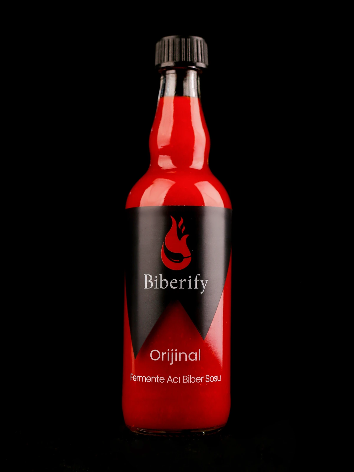
Seen from the front, Biberify’s bottle presents two unequal black points. The sauce’s colour rises between them; the icon, brand name and series name take their places around this edge. A slight turn changes that familiar arrangement as it follows the curved surface. The design begins to unfold between these views.
The Silhouette First
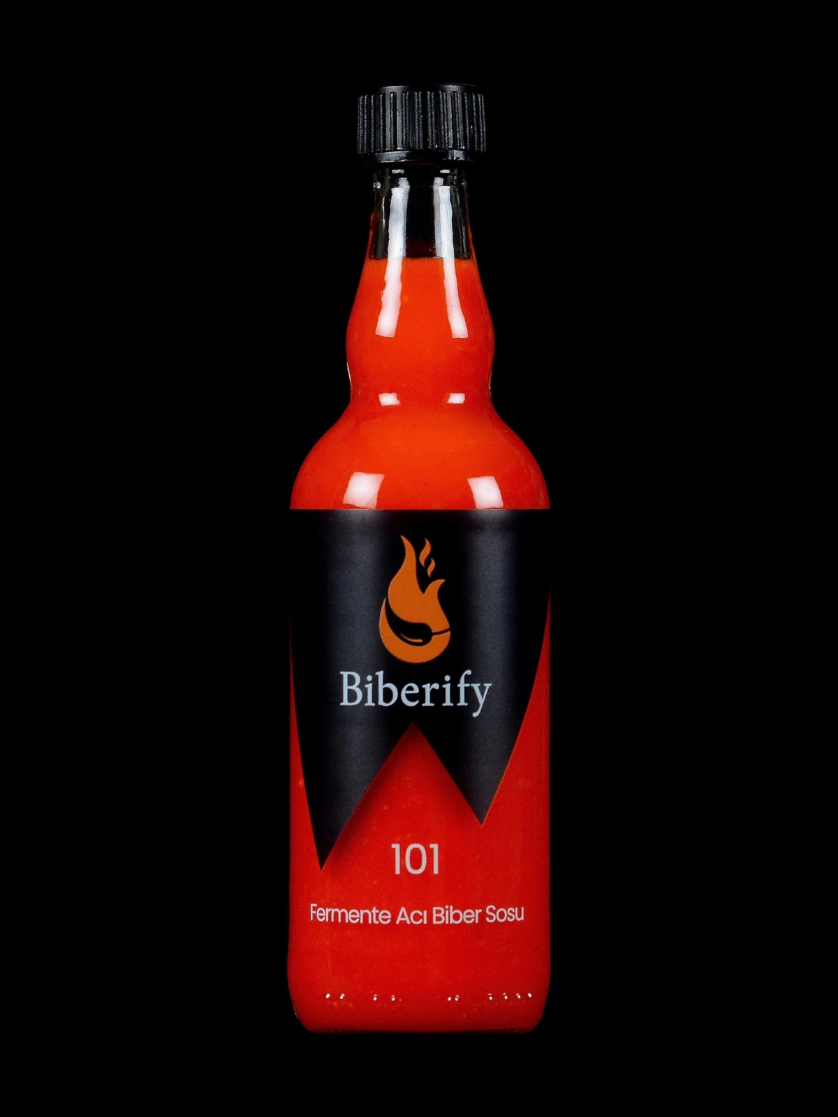
In the product photographs, a slender neck meets a rounded shoulder above the wider body. The sides draw the form downwards, while the black cap provides a dark point at the top. The sauce is clearly visible in the neck and shoulder. Before reaching the broad surface occupied by the label, we can already follow a relationship between the bottle’s outline and the colour within it.
The label introduces another movement into this upright arrangement. Beneath the name at the centre of the body, the black area descends to two different depths. The bottle’s vertical axis draws the eye towards the middle; the asymmetrical edge leads it sideways and down. The regular form and the sloping graphic lines offer different directions within the same object.
Reflections contribute to this reading. A bright patch on the shoulder, a narrow highlight along the neck and a surface darkening towards its edge reveal the body’s volume. The flat label drawing has clearly defined boundaries. Curvature, light and viewpoint become part of its appearance on the bottle.
Colour Around The Zigzag
In Biberify Orijinal’s front label design, the icon and the Biberify name sit together within the black area. The series name and “Fermente Acı Biber Sosu”—“Fermented Hot Pepper Sauce”—appear below. In the bottle photograph, the sauce’s colour fills the space around this lettering. The product’s appearance joins the words in a single composition.
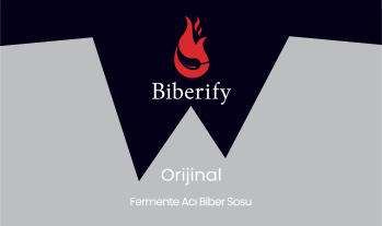
The effect of the transparent area becomes particularly apparent at the black zigzag’s edge. The colour beside that dark boundary also reveals the sauce inside the bottle. Looking at the surface means looking at the contents, too. The boundary connects what has been drawn with what has been left visible.
The brand book relates the zigzag to the teeth of the snake in the icon. Knowing this association invites us to compare the two pointed ends on the front with the details of the icon. Seen at a distance, the mark forms a strong edge; closer inspection opens it towards the brand’s own account of its meaning.
Sources For This Section
Reading The Label Step By Step
A flat label layout shows the entire surface at once. Wrapped around the bottle, part of that arrangement faces us while the sides follow the curve and recede from view. The name on the front is the centre of a wider arrangement extending around the object. Turning the bottle allows us to read it a little at a time.
Distance changes what becomes visible, too. The icon and black edge may be recognisable from across the table; closer up, the series name and product description become readable. Smaller print calls for another kind of attention. Visual identity and detailed product information meet us at different distances and through different movements.
The upper area to the left of the front panel contains a short account of Biberify’s approach to fermentation and flavour. Below it, “Enerji ve Besin Öğeleri” identifies the nutrition declaration, while “İçindekiler” marks the ingredients list. “Net”, at the lower left, states the net quantity of sauce in the bottle.
The linear GS1 barcode sits below the ingredients list. It carries the product number used to identify the product in sales and stock systems.
Short product notes on use and storage occupy the upper right. Beneath them is the producer’s statement that the product complies with the Turkish Food Codex.
In the middle of the right panel, the producer’s name appears beside “Üretici”, with the address immediately below. The following lines, “Menşei” and “İşletme Kayıt No”, give the country of origin and the production establishment’s registration information.
The email and website addresses at the lower right provide contact information. Scan the QR code beside them with your phone’s camera to open Biberify’s Instagram account.
The best-before date, labelled Tavsiye Edilen Tüketim Tarihi (TETT) in Turkish, and the batch number appear on the packaging. The batch number identifies the production batch to which the product belongs.
An Arrangement Across Different Views
Viewed at the same scale, the Biberify Orijinal, Biberify Saf, Biberify 3 Yıl and Biberify 101 photographs reveal a shared arrangement of icon, Biberify name and downward black points. The series name changes, as do the colours of the icon seen in the photographs. Comparing them suggests that recognising a bottle involves following the placement of its parts alongside any individual detail.
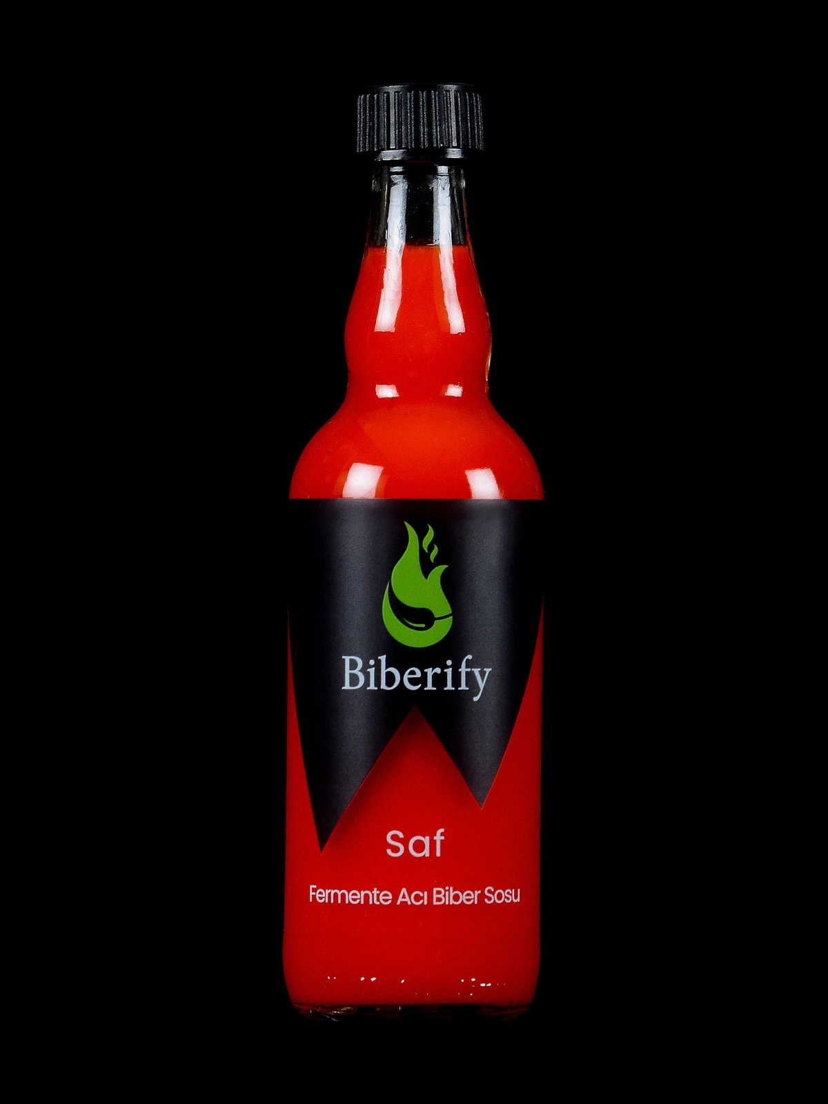
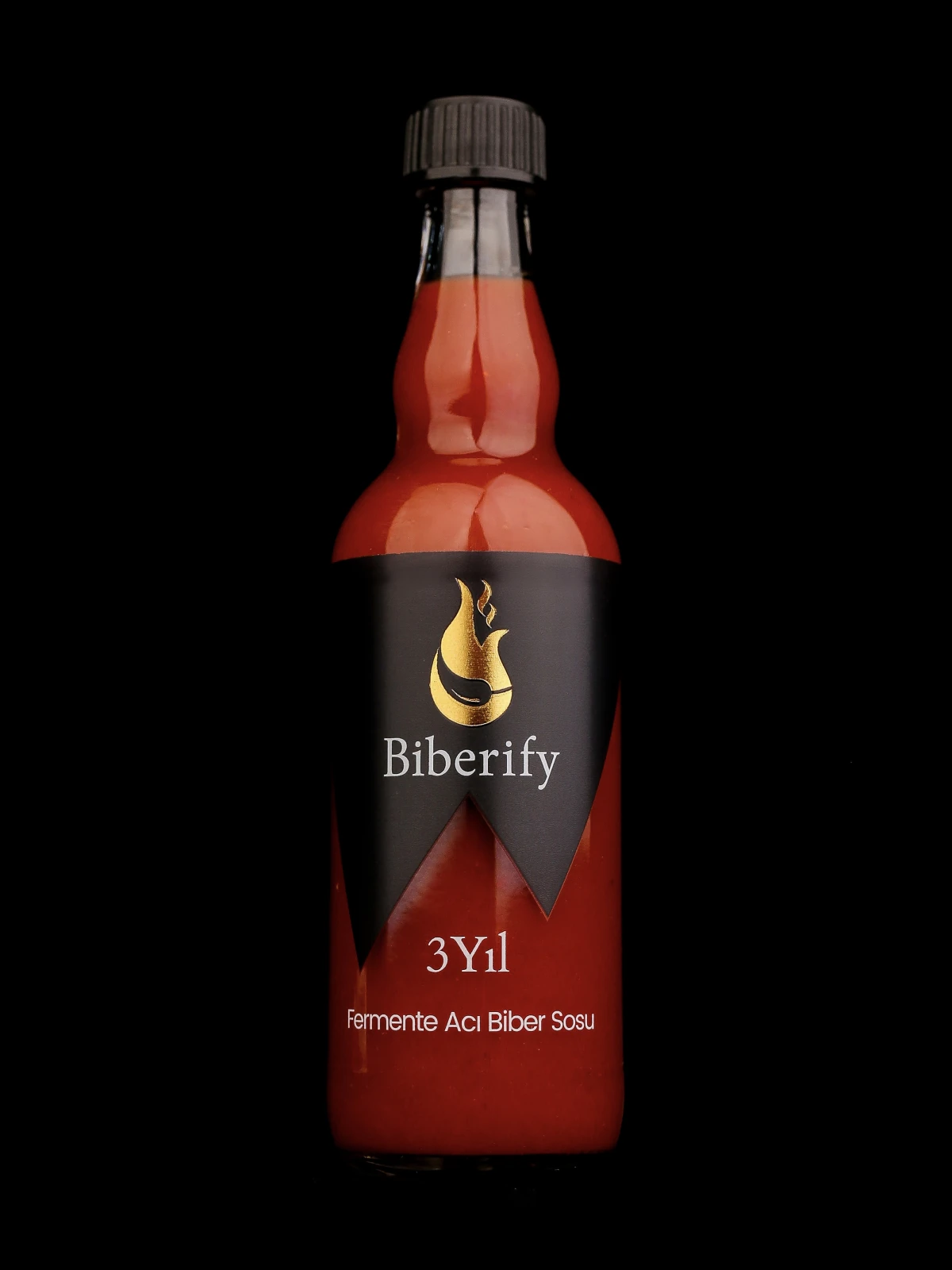
The black space around each bottle leaves room for the eye to follow its outline and the label’s edge. Biberify Orijinal’s red icon, Biberify Saf’s green and the different colours of the special series create distinct accents within the same arrangement. A colour noticed before reading the name joins the words revealed on closer inspection; the shared form makes each series’ own detail visible.
Looking closely at Biberify’s bottle takes us beyond learning its front by heart. Silhouette, lettering, black edge and the visible sauce enter different relationships as the bottle turns. Sometimes a small turn in the hand reveals another face of an object we already recognise.
Sources And Further Reading
- Biberify Orijinal Fermented Hot Pepper Sauce · Bottle Photograph
Reading area: A product photograph of the Biberify Orijinal Fermented Hot Pepper Sauce bottle’s red icon, black label, series name and silhouette.
Accessed:
- Biberify Saf Fermented Hot Pepper Sauce · Bottle Photograph
Reading area: A product photograph of the Biberify Saf Fermented Hot Pepper Sauce bottle’s green icon, black label, series name and silhouette.
Accessed:
- Biberify 3 Yıl Fermented Hot Pepper Sauce · Bottle Photograph
Reading area: A visual record of the icon, brand name, series name and asymmetrical black area on the Biberify 3 Yıl Fermented Hot Pepper Sauce bottle.
Accessed:
- Biberify 101 Fermented Hot Pepper Sauce · Bottle Photograph
Reading area: A visual record of the bottle’s neck, shoulder, cap, black label area and front lettering arrangement.
Accessed:
- Biberify Brand Book · Transparency in the Label
Reading area: The transparent label area, the brand/series/product-description order on the front, and the meaning assigned to the asymmetrical zigzag in the brand’s own account.
Accessed:
- GS1 · Product Numbers and Barcodes
Reading area: The role of a GS1 product number in identifying a product in sales and supply-chain systems.
Accessed:



